
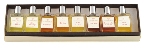
A recent discussion on BOTO got me thinking about how fragrance houses deliberately manipulate the colour of the juice to add to the mental picture you will have of the fragrance. Most perfume comes in shades of gold: pale or deep. But sometimes the juice projects the style of the fragrance.
Sarah Jessica Parker’s Lovely springs to first to my mind. I really like its silvery pink colour, which I think is rather unusual, and admire the way that colour is carried through to the packaging and the marketing. In the video ad SJP wears a silvery pink party dress while she languidly – but very stylishly – sits around doing nothing much. This delights the six-year-old girl buried even in me.
Chanel No 19 is a classic green fragrance: the EDT is bright green, and the EDP and extrait are a deeper, almost olive green, and the new Poudre is pale green.
Orientals and ambers are usually a deep golden colour, perhaps because of their ingredients, but perhaps not always. Youth Dew? Say no more. I know you are picturing it in your mind right now. Giorgio of Beverly Hills is screamingly yellow, and matches the stripey yellow of the box, and also the awnings that hung off the original store on Rodeo Drive.
Purple fragrances? Lavenders, of course. And is there a violet soliflore that is not coloured violet, either in the juice or packaging? In the 2000s Yardley’s beautiful April Violets came out in a deep shade of violet. I used to see bottles of it on eBay from time to time. After a pause on production it was released again in about 2009, this time in a clear juice. (This was my mother’s favourite fragrance. I keep a bottle to scent my handkerchiefs.)
Clear juice has been popular for years now. There are now eleventy-million clean and airy fragrances which often they contain little or no colour. The fragrances of Issey Miyake must be among the earliest entries in this category. So are Calvin Klein’s CK One and EL’s Pleasures. No wait – Chanel’s Cristalle came out in 1974. And 4711 in 1792. Beat that Issey!
Blue fragrances? Armani’s Acqua di Gioia is, unsurprisingly, a watery blue/green. Ah, but what about Mugler’s Angel, which is blue. (Or is it just the bottle?) The blue comes from ideas about stars and angels and things, obviously, and yet how different is the character of the scent with the style of the packaging.
Colouring the bottle is the obvious solution if you don’t want to colour the juice. Hello Samsara!
Which leads us to red fragrances? Um … I’m stumped there. There don’t seem to be any, are there? Too much like raspberry cordial. Or blood …
Not all fragrance houses play the colour game. Presumably natural perfumers never add artificial colours. And many of the niche lines remain aloof from colour, just as they don’t vary the design of the bottle or the label. They presumably want us to focus on the scent, not the image. The Malles are a case in point. But of course even by avoiding image-making, they still create an image.

Thank you so much Anne-Marie, for carrying the torch while I’ve been packing/moving/unpacking!
First, to answer the Red Juice question: Anne Pliska! It’s a vivid red—an electrified shade of blood 😉
On color in my juice: I don’t so much love it. There is constantly the worry that it will stain clothes (I realize that even colorless juices can do this, but the mind is a tricksey thing), so sometimes I’ll refrain from wearing an obviously colored perfume depending on my outfit for the day. I’ve had some staining occur, and it’s such a bummer. Perfume is supposed to improve your day! LOL.
Oh Anne Pliksa! I had forgotten that one. I’ve had some stainging too, and I am trying to remember the culprit. One of the Taurers I think. Some of them are very deep in colour, and dense with strong ingredients too!
Hope you can see your way through the boxes to the couch. 🙂
annemariec, sorry 🙂 I realized it was your post only when I came to your question about the red juice. I thought: can it be that Dee forgot about her recent favorite Anne Pilska?!! Then I scrolled up to check who was the author.
By Kilian Love – don’t be shy! is red as well.
I hate the really colored juices like Sarrasins or Fille en Aiguilles, since I fear staining, my work clothes used to be white after all…
I love the color in natural perfumes though, it is just what it is, without a marketing strategy behind it.
Yes, I like the idea of the product stripped down to its essentials, with no (or little) marketing.
I remembered another colored By Kilian. A Taste of Haven is naturally green from the lavender oil.
A great post!
I find it really difficult to pay attention to the colour in perfume, which I find sometimes detrimental when coming up with my own ideas about a fragrance.
That said, I do enjoy the way colour is used as part of a fragrances concept, you’ve picked some great examples but my favourites would be Angel and Alien. Weirdly Angel, despitely being completely brown in nature (chocolate/patchouli etc) it will always smell blue to me. The same with Alien, it’s a huge white floral that smells purple.
It looks like I’m very easily led by the colour :S
Yes, I think most of us are, and more than we realise. I’m glad you mention Angel and Alien. Those are the weirdest examples of disjunction between colour and smell.
I love Angel and I also always thought of it as of a blue scent.
I have been thinking about this too- that is, how much of my multi-sensory perception of scent is due to the color of the juice..I don’t think I consciously pay attention or care about the color of the scent..However, as Birgit mentioned, I love the jewel-toned colors of natural perfume – it adds to the feel of wearing something precious.
However, most of the time, I see perfume in color even if they are colorless- e.g PdN le Temp is a greenish yellow (even though the juice is colorless), FM Therese is a sunlit yellow..Cepes and Tuberose is a dusty pink with red flecks , SL Vitriol smells pale purple..
I must admit, I do love amber-colored perfume , especially when I am wearing extrait- it makes the extrait seem more concentrated somehow, as if the essences are more present..And I am sure fragrance houses use this to their advantage..Finally, though, I think the juice is all that matters. As candy perfume boy said, I’d rather the color come from my own head..Deliberately coloring the juice could sometimes be like the manipulative background score in film.
Ah, now that is interesting – you colour the perfume out of your head. Funny, I get an idea of pink from Fracas, a tuberose fragrance, but maybe that is because I have seen an ad for it featuring a woman in a lovely pink dress.
The ultimate would be to get a group together to do a blind test of a few fragrances. You don’t get to see them, just smell them. You compare your impressions to see what colours they suggest. Fun!
I’d prefer that all my perfumes were colorless and that the only colors were the ones that appeared in my imagination upon smelling the fragrance in question – unless the some of the ingredients themselves color the juice.
I’m largely annoyed by the manipulation through colors by the producers of the fragrances, but I tend to try and disregard it most of the time. After all, I’m not really a very visual person, and many visual marketing ploys are often wasted on me. Or so I like to believe 😉
None of us like the idea that we are being manipulated in ways that we cannot quite perceive. It makes us feel a bit powerless. Still, the main thing is to be aware that it is happening. That is why I go along happily with the gossamer pinkness of SJP’s Lovely. I know that perfume does not come in that colour – they have added it. Still I think – what the heck! It;s pretty. You’ve got to let yourself go some time.
Funny, that shade of pink it is not a colour I normally like, or would wear …
The colour of the juice is part of the aesthetic statement of the perfume I believe, and I don’t feel manipulated by a coloured juice. I must admit that the colour of Sarrasins was a big attraction and I will never know if it set the nocturnal tone to the fragrances or it just complimented it. It would be interesting to know if there are any vision impaired fragrance lovers out there and compare notes.
On the opposite side of the spectrum, I was shocked at how dark Montale Patchouli Leaves is even though it is bottled in an aluminium vial and we are not supposed to see its colour.
Good point about the vision impaired.
I had forgotten about the Montales. They don’t trade off the colour of the juice at all. Rive Gauche is another one. Good protection for the juice, that’s for sure!
I haven’t had a chance to try Sarrasins yet but for me its color is one of the reasons I want to. I think it’s beautiful.
I am one of those that do like coloured perfumes. Like Memory of Scent I think they do add to the overall feel of the perfume and I do enjoy the whole aesthetic. I’ve never tried anything by Mona di Orio (which sound great) but I am incredibly attracted to the colour of the juice because there’s no label on the bottle getting in the way and it looks to me the way truly opulent perfume should look – rich and golden.
I also imagine colours if they are not in the juice itself and admit to you annemarie, that I actually won’t wear a dress if it’s a colour that doesn’t match the “imagined” colour of the perfume I want to wear that day! Nuts you say? Most definitely!
Ah, we are all a bit nuts. I think I have made those sorts of dress decisions too, without particularly being aware.
Chanel No 5 EDP is a lovely rich golden colour, now I think of it. How I wish we could display our bottles all the time!
I think I am fairly indifferent to the physical color of the juice (except when it is deep enough that I fear it will stain), but like the other commenters I do “color” the perfumes in my head. It is interesting to me that people generally agree on what color is associated with each perfume. (Although to me, Fracas is red, not pink, so perhaps not an exact thing. 🙂 )
Thinking about all the pink and blue and purples fragrances we have been discussing, I’m now wondering if those colours stain as much as the golden colours? My thought is no, but I’m not really suer.
Now, when I meddled into everybody else’s responses, here’s mine.
I do not want all my perfumes to have some special color but for some of them I like that they do. I do not think that it’s a bigger “manipulation” than making nice bottles and packaging. I try not to apply perfumes to anything that can be stained so this part isn’t a big concern for me as well.
With Chanel No 19 I’m really glad they’ve changed the original amber color to green – that’s how I see EdT and I wouldn’t want to have it any other way.
I like that Mille et Une Roses (Lancome) is pale blue – I think it’s pretty.
I just looked up Mille et Une Roses – that is a very pretty colour. Suggestive of a blue rose? Lovely idea. I agree with you on Chanel No 19. Green is my favourite colour and that might have been what attracted me to No 19 in the first place. There must have been some now long forgotten moment at the fragrance counter when I drifted towards a tester, drawn by the colour.
Sometimes color can work against a perfume. I have heard from many SAs that the reason that L de Lolita Lempicka has been discontinued in the U.S. is that women were getting freaked out by the rapid color change to a dark brown liquid. Which maddens me, because I NEED my L de Lolita Lempicka! Get it together, American women!
So do you mean that the colour of the juice was too much of a surprise after the colour of the bottle? That is interesting. I see that Fragrancex has L de Lolita at rock bottom prices, so damn it, I’m gonna try it. I’ve looked at pix of the bottles often enough, and been intrigued.
I hope you like it, Anne Marie! It’s a really well-done gourmand. I think the color problem was that the LdeL juice started out a sort of dark green color, but became brown over the course of a few months. People assumed that it had gone bad, even though the smell doesn’t change.
Ewww … that sounds really weird. Now I’m double intrigued! I can see why people would be freaked out.
Cool! I haven’t really thought much of the perfume colors but if I may ask, what are the colors of pheromore’s pheromone scents? I’m quite curious as well.
Sorry, I’m afraid I don’t know. Thanks for the link though – intriguing!
I love the idea of colored fragrances. I think it just adds to the synesthesia that fragrance can inspire. I think it was a good move on Chanel’s part to make No. 19’s juice green, perhaps as a warning to those who don’t like green fragrances, and as a further enticement to those who do. (Too bad, however, that they gutted it of its wonderful moss, vetiver and leather at the same time!)
I’ve never tried Sarrasins, but Luca Turin’s warning about it staining paper and fabric like wine made it more appealing to me! Perfume like ink…
Thought-provoking post, Anne-Marie!
Hi Barbara, apologies for my belated reply. Ha! If you don’t like the current version of No 19, you will hate the new flanker, No 19 Poudre. All floaty, with a clean musk base.
While we are talking about colors in perfumes let’s not forget the ultimate marketing stunt involiving color: Boudicca Wode, the perfume that came bright blue out of the bottle and slowly faded into nothingness as it dried! It did have a tendency to stain clothes though as it has been reported.